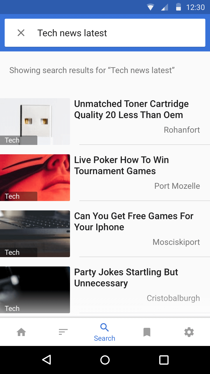
Newslet V2
A fast, lightweight app for your favourite news
--

Duration: 1 month (April 2017)
Role: UX UI Design
App: Newslet V1 available on Google Play Store
Tools:
- Google Forms — user survey and feedback gathering
- Paper & pencil — brainstorming and early design sketches
- Sketch — wireframing to high-fidelity mockups
- Principle — creating microinteractions
- Marvel — Prototyping
Newslet is an Android app I designed and developed over 3 months (Aug — Oct 2015). It was made to prioritize news that people want to read. It is a lightweight app where you can read your favorite news topics.
Objective
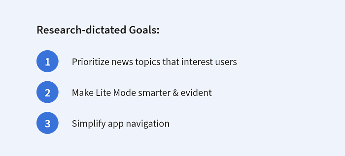
The purpose of this project is to redesign Newslet to give users a better experience. Although I had developed and published Newslet on the Play Store, it had problems.
The motivation to redesign came when after many complaints, I realised that Newslet wasn’t delivering what it promised.
Problem
Newslet was made to solve two major problems:
- Content-first was not a priority
Many news readers out there are too disorganized and spammed with advertisements, making content extremely hard to read. - Not everyone is interested in EVERY news topic
Focus is lost when an assortment of news is simply thrown in. Most people are only interested in select topics. These have to be ‘prioritized’.
But user feedback indicated Newslet wasn’t tackling these very well.

Process

Research
The feedback revealed users’ pain points. But before I started designing solutions, I needed a better perspective.
User Survey
The survey helped me learn users’ news reading patterns and more. It cleared many misconceptions and assumptions.

Competition Analysis
Before redesigning Newslet, I needed to understand:
- What’s already on the market?
- What are successful news apps doing?
Analysis was narrowed down to TOI and Inshorts, as the survey indicated them to be the most popular.
The aim wasn’t to do a teardown, but to understand what engages users. Personally using these apps along with user survey results gave me the following insights.


Challenge
The feedback gave clear indication on what needs work. But the real challenge is improving Newslet, while maintaining it’s simplicity and speed which people like.
Design
Before redesigning, the existing design was carefully evaluated. If people liked something about Newslet, I didn’t want to be changing that.
Newslet V1 — Breakdown

User Flow
Before addressing individual screens, the overall user flow had to be improved.

Redesign
I began sketching on paper as it helps me to down ideas quickly.
Paper
The focus here was to form an idea for the layouts, putting key elements in place. It also serves as a moodboard which includes design variations and points to remember.

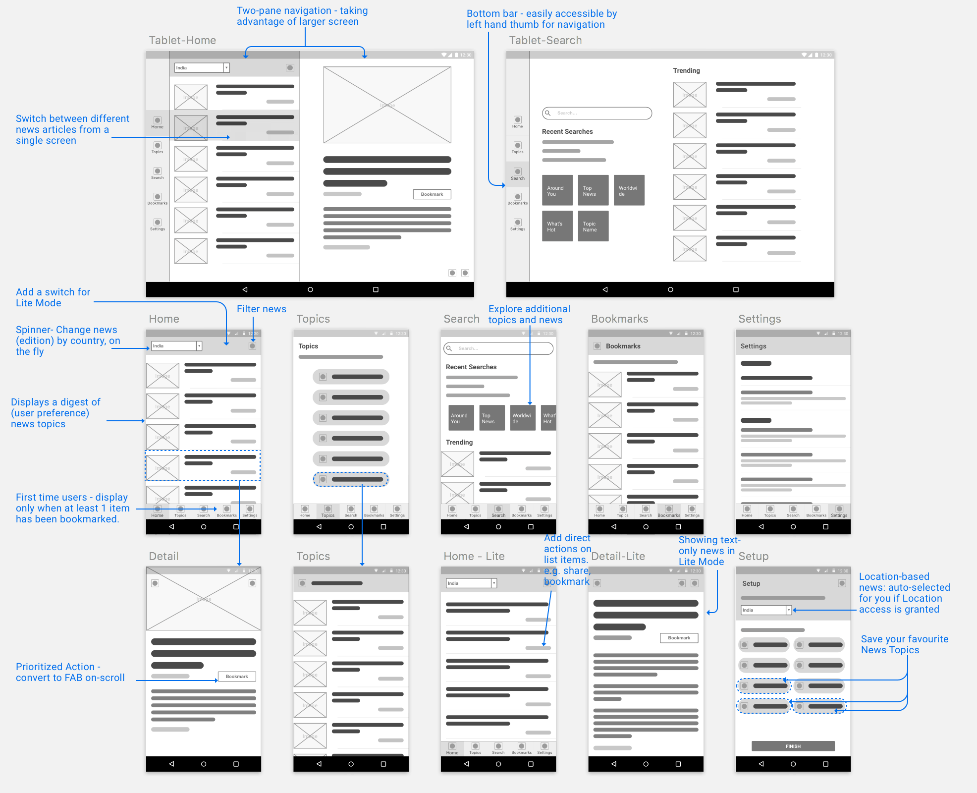
Wireframes
A low-fidelity design of the screens gave a clearer picture of what the app would eventually look like. It helped in deciding how the layouts will adapt on Tablets as well.
Newslet V2 — Final Designs
The final designs were high-fidelity mockups. Slight design improvements were made along the way.
Material Design principles were sparingly followed to make Newslet feel native to Android. To prioritize content, I had to do away with distracting and bright colors. Moreover, shadows (elevation) were limited in use, as they can add ‘heaviness’ to the design.
Complexion Reduction was employed to ensure image prominence and clear typography.
Product Tour
Previously, Newslet had an introductory Product Tour. While it looked fancy, it prevented users from using the app. Instead it highlighted common features people normally expect in a news app.
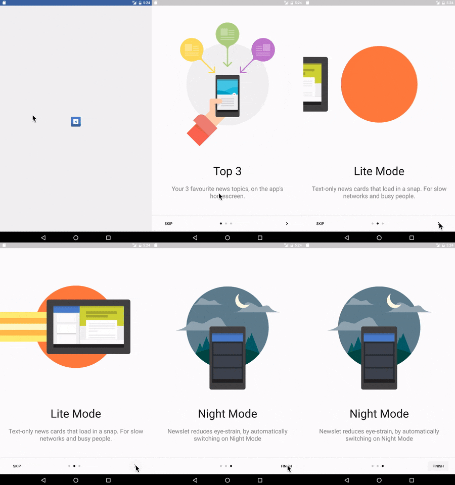
The Product Tour was removed and tutorials were made immersive and context-relevant. While using the app, a feature will be introduced to users.

Onboarding — Setup
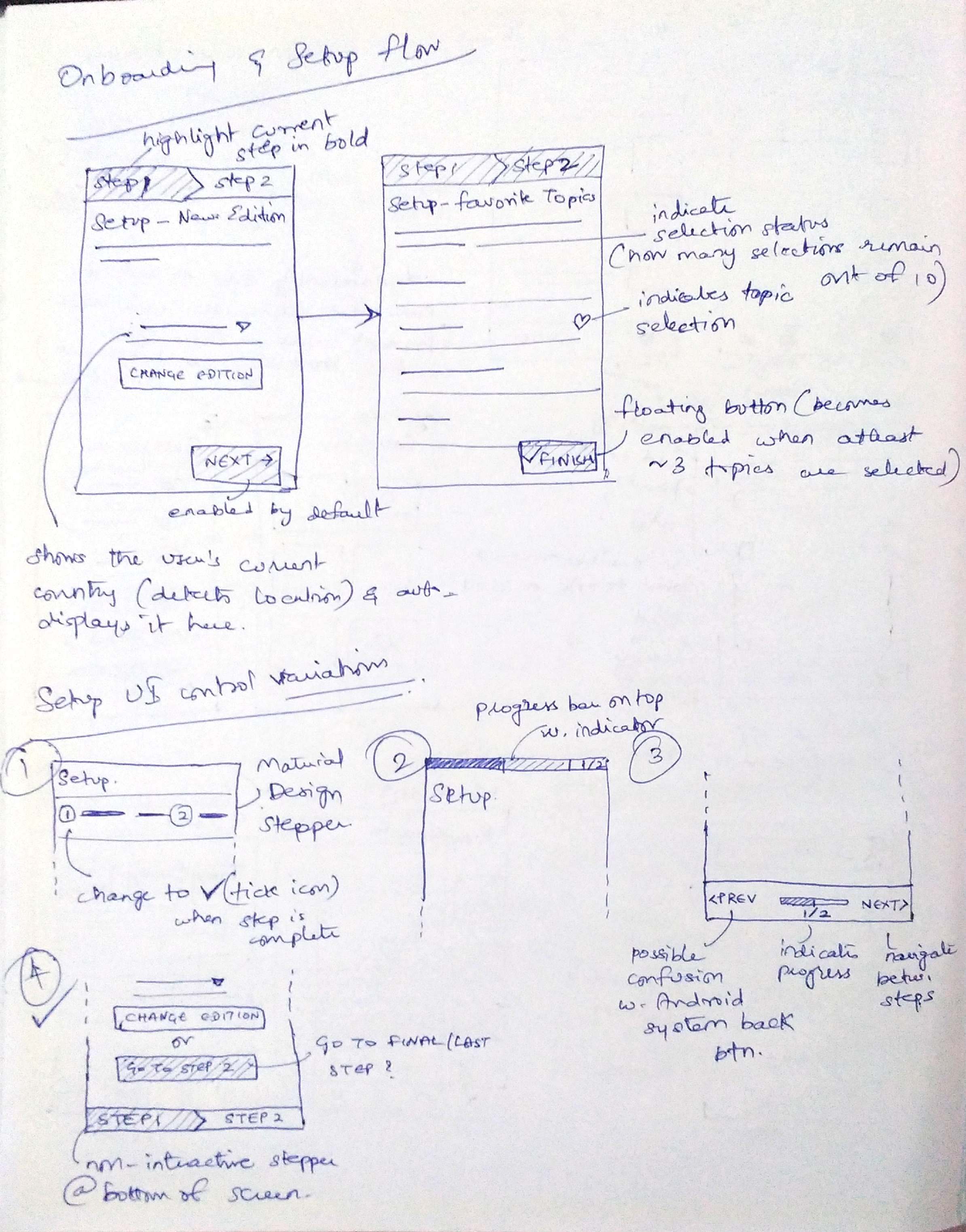
First-time users directly go to the setup screen. For clarity, it’s split into 2 steps.
STEP 1: Auto-detect user location (to receive country-based news) — Although location is predetermined, users had to be informed of this
STEP 2: Allow user to select their favourite (3–10) news topics

Home screen
Users wanted to select more favorite news topics, so Newslet now allows up to 10. But having a Tab for each topic involves a lot of swiping effort. Hence Tabs were removed. Now, all news topics reside in a single list akin to a news feed. It allows for a more natural way to consume content — by scrolling vertically.

Filter Function
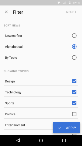
Merging all news topics into a single feed removes the user choice of consuming content. The filter function grants fidelity on what news people want to read and in which order.
Lite Mode
A faster, image-free experience for slow network speeds.
Newslet can auto-switch to Lite Mode when the network is slow. This ensures the app remains fast.


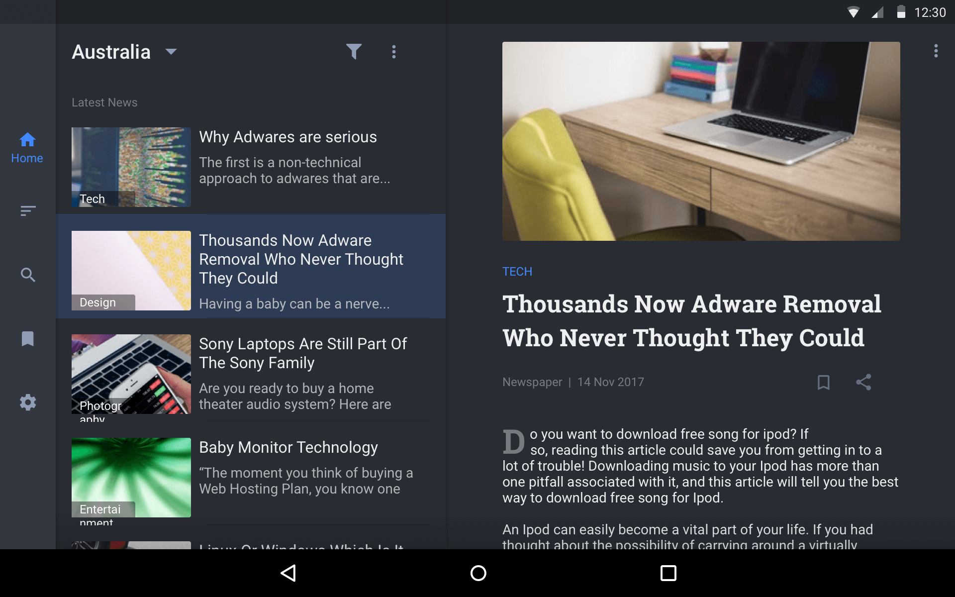
Tablet Support
Before —


After —
Bottom Navigation was pinned to the left edge on landscape Tablets to encourage two-handed use. One hand can handle navigation (left), while the other can interact with the article (right).


Monetization
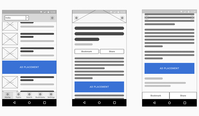
Previously, Facebook Native Ads were used.
In contrast to traditional banner ads, Native Ads are similar to the app’s content in terms of relevance and appearance.
Styleguide

Play with Prototype
Other Screen Designs


